Trends in Romance Novel Covers
I got a little curious lately about the shift in romance novel covers. It used to be a girl with her dress falling off. Then it was a girl with her dress falling off, with Fabio. Then a flap with flowers, covering a girl with her dress falling off, with Fabio. Then some hot kissing couples. What is it now? According to the data, the most popular romance cover looks a little like this:
 *Example pulled from #1 Amazon bestseller spot.
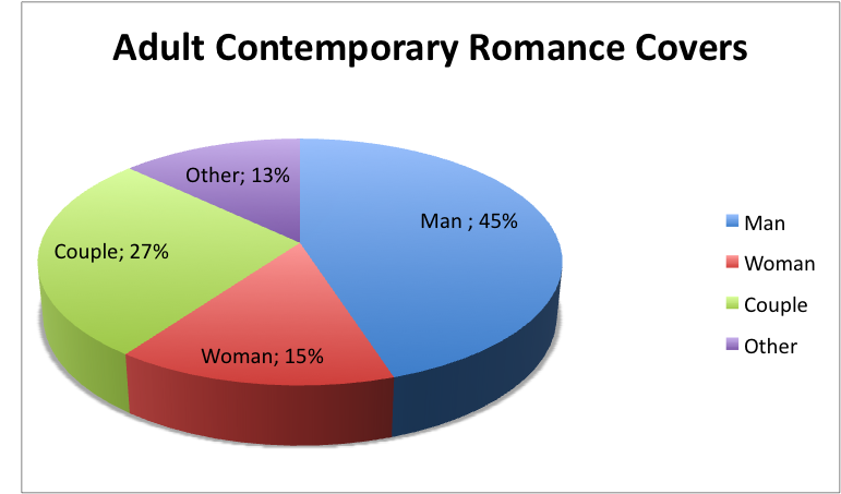
To find out more, I did a quick comparison of Adult Contemporary covers vs New Adult covers, for my own research, and because I’m me, I made pie charts. And because I had pie charts, I decided to share them (if you have pie and don’t share it, you go to hell. It is known.)
It looks like the heyday of the couple is over–it’s all about the dudes. But let’s take a more in depth look here at what people are doing on romance covers:
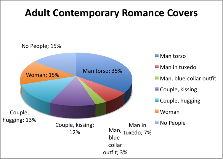 So, it’s really about the abs. And rich guys are beating working-class guys two to one! Then again, a tuxedo is very flattering. I think a toolbelt is even more flattering, but I might be in the minority here.
Interesting fact: the plainest covers came from the most famous authors. Nora Roberts even had one that was almost entirely white space. I mean, she’s Nora Freaking Roberts. She doesn’t even need to slap a title on that baby, and it’d still sell.
Alright, so what does this breakdown look like for NA (New Adult, ages 18-25)?
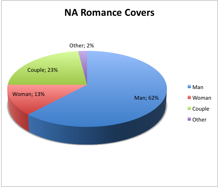 Wow! Okay, so the younger crowd likes the gentlemen EVEN MORE! Let’s look at the detail breakdown:
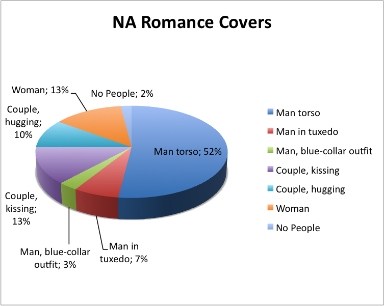 Lots of abs, lots of tats, and again, white collar beats out blue collar 2:1.The data is a little skewed in terms of single females on the cover, as most were from one author. It’s pretty clear which character is romance readers’ favorite…
One sad factoid: there was only one cover where the couple wasn’t touching, and it was because it was an interracial romance and they clearly had to photoshop two people together to get something that worked. The world could really use more diverse stock photography, am I right?
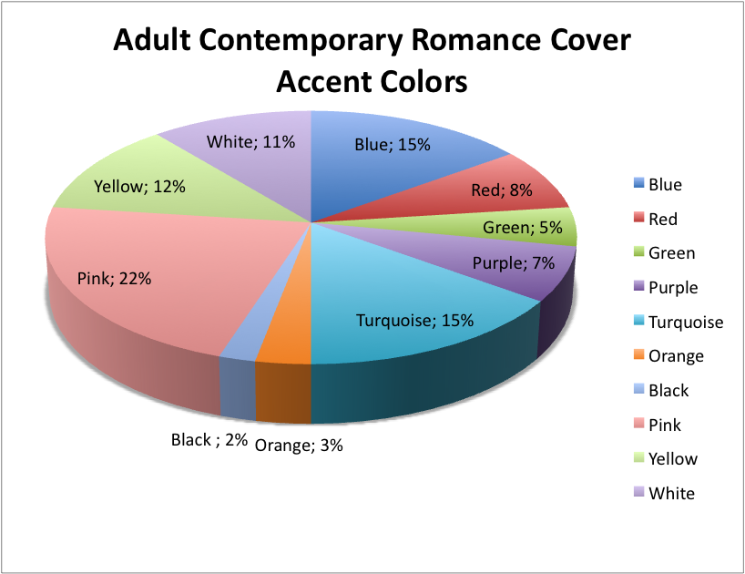
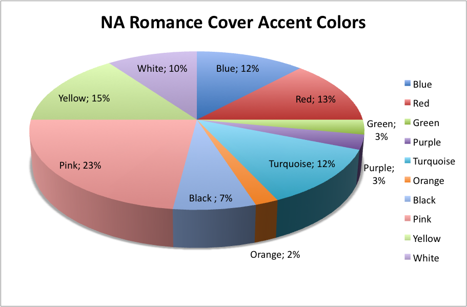
I also noticed there was a tendency for really bright color pops, especially in fonts, so I ran a quick analysis on colors as well:
Pink, turquoise and blue were the big winners for Adult Contemporary covers.
Pink, turquoise, blue and red for the NA crowd.
What do you guys think? Is this a trend of bestsellers or a trend of romances overall? Amazon only lists the top 100 bestselling books, and when I analyzed the covers of the books in spots 60-10, the results were very similar to the bestselling top 60, so it could be that these are trends throughout the industry, not indicative of trends in what sells. Then again, ALL those books are in the top 100, so they sell pretty well. It could be that if you had a list of very poorly selling romances, you could see more of a trend in what does NOT sell. I will say all the books I saw had very professional looking covers, nothing homemade or amateurish. What do you guys think? Is it the cover selling the book or the book, selling the cover?
Whatever way you look at it, the takeaway message is abs, with a side of biceps.
§
*For this data, I analyzed the top 60 bestselling books on Amazon in each category on June 28, 2017. You might get slightly different data for print books, as Amazon carries lots of e-only titles in romance.*



The male torso is hot in the historical romance category, as well. It is the decade of the inguinal crease . . .
I’m not going to lie, I’m drawn to a book by the cover and the male torso cover will get a look each time. But, I’ve also gotten particular about these covers. There are some that are more professional and less goofy looking. There are now a group of male models that are “go to” guys for many readers. Take that a step further and look at how many of the men are tattooed (some photoshopped, some not). This is big business right now and if you check Instagram you can’t help but trio over these guys. And book conventions? These guys reign. (Stu Reardon in particular).
How about “Seasoned” or “Mature” Romance? I wonder if the data would vary drastically? Just a thought. (Loved the comment on pie. It was my laugh for the day! Thanks!)
The most common trend that is ongoing is putting shirtless male images on the front cover. I got many requests for shirtless male images from romance publishers for their cover need.